How to Choose Living Room Paint Colors
Choosing the right paint colors for your living room can feel like a daunting task, but with a bit of guidance and some inspiration, you can transform your space into a stylish and inviting oasis. Whether you’re drawn to modern home interior paint colors or prefer classic hues, this guide will help you navigate through the process. We’ll explore popular paint colors, share interior paint ideas, and offer tips to help you select the perfect shades for your living room.
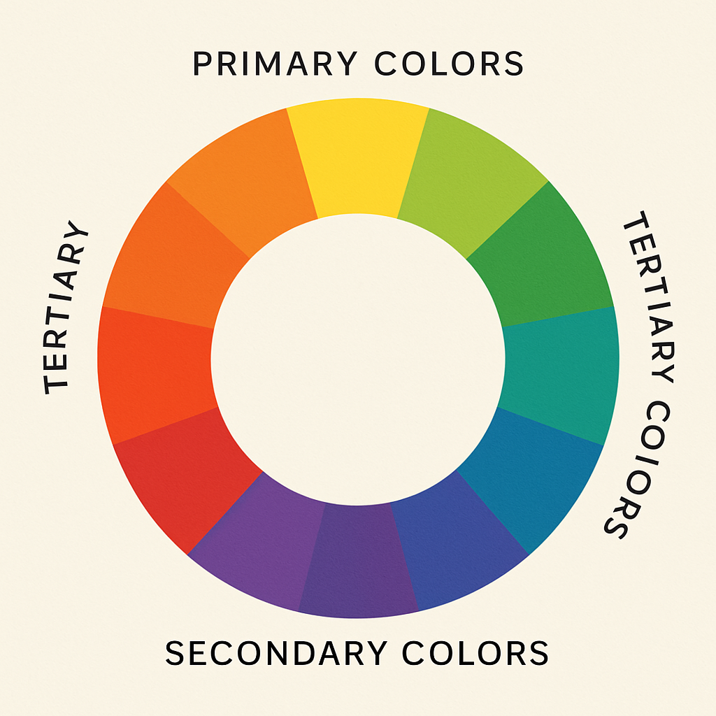
Before diving into specific paint colors, it’s helpful to understand the basics of color theory. The color wheel is a tool that illustrates the relationships between colors. It includes primary colors (red, blue, and yellow), secondary colors (green, orange, and purple), and tertiary colors, which are combinations of primary and secondary hues. Understanding these relationships can help you create a harmonious color scheme for your living room.
The Role of Primary Colors
Primary colors form the foundation of the color wheel and are the basis for creating all other colors. Red, blue, and yellow are pure colors that cannot be created by mixing other hues. These colors are vibrant and can be used to create bold statements in your living room. By understanding how to use primary colors effectively, you can create a balanced and engaging space.
The Dynamics of Secondary Colors
Secondary colors are created by mixing two primary colors. For instance, red and blue create purple, blue and yellow make green, and yellow and red result in orange. These colors are versatile and can add depth to your living room palette. Consider using secondary colors to complement or contrast with primary colors for a dynamic effect.
Exploring Tertiary Colors
Tertiary colors are formed by mixing a primary color with a nearby secondary color. These include hues like red-orange, blue-green, and yellow-green. Tertiary colors offer a wide range of possibilities for creating subtle variations in your color scheme. They can be used to add complexity and interest to your living room design.
Color Harmony and Balance
Color harmony refers to the pleasing arrangement of colors. It’s about finding the right combination of hues that create a sense of balance and unity in your living room. Using complementary colors (those opposite each other on the color wheel) or analogous colors (those next to each other) can help achieve this harmony. Understanding these principles will guide you in creating a cohesive look.
Psychological Impact of Colors
Different colors can evoke various emotions and moods. Warm colors like red and orange can energize a space, while cool colors like blue and green tend to calm it. Neutral colors, such as beige and gray, provide a soothing backdrop. Being aware of the psychological impact of colors can help you design a living room that feels comfortable and inviting.
Exploring Popular Living Room Paint Colors
When it comes to selecting paint colors for your living room, there are several popular options to consider. These colors are favored for their ability to enhance the aesthetics and ambiance of a space.
Classic Whites and Grays
White and gray are perennial favorites for interior walls. They offer a clean, modern look and serve as a perfect canvas for artwork and decorative elements. Consider using a soft white for a bright and airy feel or a light gray for a sophisticated touch.
Versatility of White
White paint is incredibly versatile and can make a room feel larger and more open. It reflects light beautifully, enhancing natural light and making your living room feel bright and welcoming. White is also a neutral backdrop, allowing you to experiment with colorful furnishings and accessories without clashing.
Modern Appeal of Gray
Gray has gained popularity as a modern alternative to white. It comes in various shades, from light silvers to deep charcoals, offering a wide range of options. Gray can impart a sleek, contemporary look while still providing a neutral base for your decor. Consider pairing gray walls with bold art pieces or vibrant furniture to create a balanced space.
Achieving Balance with Neutrals
Combining white and gray can create a harmonious balance in your living room. Use white for the main walls and introduce gray through accent pieces or a feature wall. This combination maintains a clean aesthetic while adding depth and dimension to the room.
Earthy Greens and Blues
Earth tones like sage green and slate blue are becoming increasingly popular in modern home interior paint colors. These hues bring a sense of nature indoors and work well with both traditional and contemporary decor.
Bringing the Outdoors In
Using earthy greens and blues can create a tranquil, nature-inspired atmosphere in your living room. Sage green evokes the calmness of lush landscapes, while slate blue mirrors the serenity of the sky and sea. These colors can help establish a peaceful retreat within your home.
Pairing with Natural Materials
Earth tones pair beautifully with natural materials such as wood, stone, and plants. Consider incorporating wooden furniture, stone accents, or potted greenery to enhance the organic feel of your living room. These elements complement the earthy color palette and create a cohesive design.
Versatility in Style
Whether your style is rustic, modern, or eclectic, earthy greens and blues can adapt to various aesthetics. These colors can be dressed up with elegant decor for a sophisticated look or combined with vintage elements for a cozy, lived-in feel. Their versatility makes them an excellent choice for any living room.
Bold and Vibrant Hues
If you want to make a statement, consider bold colors like deep navy, rich burgundy, or vibrant mustard. These shades can add drama and personality to your living room, especially when paired with contrasting neutral elements.
Creating Focal Points
Bold colors can be used to create focal points in your living room. Consider painting one wall in a vibrant hue to draw attention and add visual interest. This technique can highlight architectural features or showcase a favorite piece of art.
Playing with Contrast
Pairing bold colors with neutral tones can create a striking contrast that enhances the drama of your living room. Use neutrals like white or gray to balance the intensity of bold hues, ensuring the space remains inviting and harmonious. This approach allows you to experiment with daring colors without overwhelming the room.
Expressing Personal Style
Bold colors provide an opportunity to express your unique style and personality. Whether you prefer the regal elegance of burgundy or the energetic vibrancy of mustard, these colors can reflect your taste and make your living room feel distinctly yours. Don’t be afraid to take risks and embrace colors that resonate with you.
Pastel Tones
Pastels are perfect for creating a soft and inviting atmosphere. Light pinks, baby blues, and gentle lavenders can add a touch of elegance and warmth to your living space.
Evoking Tranquility
Pastel tones have a calming effect, making them ideal for creating a serene living room environment. Soft hues like blush pink or powder blue can soothe the senses and promote relaxation. These colors can transform your living space into a peaceful oasis where you can unwind.
Enhancing Natural Light
Pastels reflect natural light beautifully, brightening up your living room and making it feel more open and airy. They can enhance the sense of space and create a light, cheerful ambiance. Consider using pastels in rooms with large windows to maximize the effect.
Mixing and Matching
Pastels can be mixed and matched to create a playful yet sophisticated color scheme. Combine different pastel shades for a layered look that adds depth without overwhelming the room. This approach works well with both modern and vintage decor styles, offering endless possibilities for creativity.
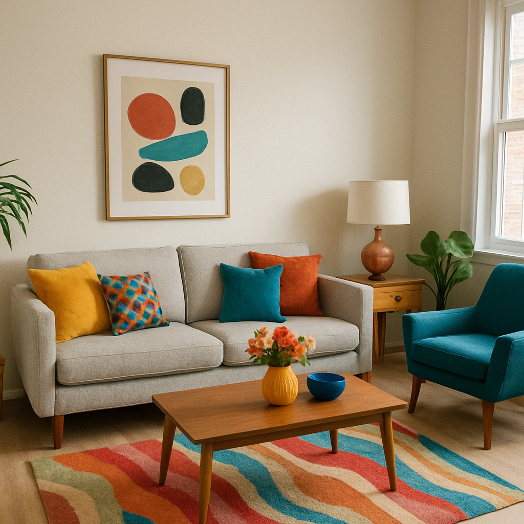
Tips for Choosing the Right Paint Color

by Krakograff Textures (https://unsplash.com/@krakograff)
Selecting the perfect paint color for your living room involves more than just picking a shade you like. Here are some tips to guide you through the decision-making process:
Consider Lighting
Natural and artificial light can dramatically affect how a paint color looks in your room. Observe how the color changes throughout the day by testing swatches on your walls. This will help you determine if the color maintains its appeal under different lighting conditions.
The Impact of Natural Light
Natural light can vary significantly throughout the day, affecting how paint colors appear. Morning light may cast a warm glow, while afternoon light can be cooler and harsher. Consider how much natural light your living room receives and how it influences the colors you’re considering. Testing colors at different times of the day will give you a better sense of their true appearance.
The Role of Artificial Lighting
Artificial lighting, such as overhead fixtures and lamps, can also alter the perception of paint colors. Warm light bulbs can enhance warm tones, while cool bulbs can accentuate cooler shades. Pay attention to your room’s lighting sources and how they interact with your chosen colors. Experimenting with different lighting options can help you achieve the desired ambiance.
Testing in Different Seasons
The changing seasons can impact the lighting in your home. A color that looks perfect in summer may feel too dark in winter. Consider how the seasons affect the natural light in your living room and plan your color choices accordingly. Testing paint colors throughout the year ensures they remain appealing regardless of the season.
Complement Your Furniture and Decor
Take into account the colors of your existing furniture and decor when choosing paint colors. Aim for a cohesive look by selecting shades that complement or contrast with your furnishings in a pleasing way.
Harmonizing with Existing Pieces
Your living room’s furniture and decor play a crucial role in the overall color scheme. Consider the color and style of your sofa, rugs, and artwork when selecting paint colors. Choosing shades that harmonize with these elements will create a cohesive and balanced look.
Creating Contrast
If you want to highlight specific pieces of furniture or decor, consider using contrasting paint colors. For example, a dark wall can make light-colored furniture stand out, while a light wall can provide a backdrop for bold decor items. This approach draws attention to your favorite pieces and adds visual interest to the room.
Adapting to Different Styles
Whether your living room is modern, traditional, or eclectic, your paint colors should complement the overall style. Choose colors that enhance the aesthetic you’re aiming for and ensure they work well with your decor elements. This consideration will help you achieve a unified and polished look.
Test Before You Commit
Before committing to a full paint job, purchase sample-sized cans of your chosen colors and apply them to small sections of your walls. This will give you a better sense of how the color will look in your space.
The Importance of Sampling
Sampling paint colors is an essential step in the selection process. Even if a color looks perfect on a swatch or in a store, it may appear differently in your home. Applying samples to your walls allows you to see how the color interacts with your lighting and surroundings, helping you make a more informed decision.
Trying Multiple Colors
Don’t hesitate to test multiple colors before making your final choice. Apply several samples side by side to compare them under the same conditions. This approach allows you to see subtle differences and choose the shade that best suits your living room.
Observing Over Time
Take your time to observe the sampled colors over several days. Notice how they look during different times and in various lighting conditions. This observation period will help you gain confidence in your decision and ensure you’re satisfied with your choice before committing to a full paint job.
Use Accent Walls Wisely
Accent walls can add depth and interest to a room, but they can also overpower a space if not done carefully. Choose a wall that naturally draws attention, such as one with a fireplace or large window, and paint it a contrasting color to create a focal point.
Selecting the Right Wall
Choosing the right wall for an accent color is crucial for achieving the desired effect. Look for architectural features like a fireplace, a large window, or built-in shelves that naturally draw attention. Painting these areas in a contrasting color can highlight them and create a captivating focal point.
Balancing with Neutrals
When using bold colors for an accent wall, balance them with neutral tones on the other walls. This approach prevents the bold color from overwhelming the space and ensures a harmonious look. Neutrals provide a calming backdrop that allows the accent wall to stand out without dominating the room.
Experimenting with Patterns
Consider experimenting with patterns or textures on your accent wall to add an extra layer of interest. Techniques like stripes, stencils, or textured finishes can create a unique and eye-catching feature. This creativity can transform your living room into a personalized and visually dynamic space.
Creating a Cohesive Color Scheme
When selecting paint colors for your living room, it’s essential to consider how they will interact with the rest of your home’s color scheme. Here are some strategies for creating a harmonious flow:
Stick to a Limited Palette
Choose a limited palette of 3-4 colors to use throughout your home. This will create a sense of unity and make it easier to transition between rooms.
Establishing a Core Palette
Start by identifying a core palette of 3-4 colors that you love and that work well together. These colors should complement each other and reflect your overall style. Having a core palette provides a foundation for all your design decisions and ensures a cohesive look throughout your home.
Using Accent Colors
Incorporate accent colors within your core palette to add depth and interest. Accent colors can be used for accessories, textiles, and smaller decor items. They should complement the primary colors and provide subtle variations without disrupting the overall harmony.
Maintaining Consistency
Consistency is key to creating a cohesive color scheme. Ensure that your chosen palette is reflected in every room, from the living room to the bedrooms. This uniformity will make your home feel more connected and thoughtfully designed.
Use Color in Different Ways
Incorporate your chosen colors in various ways, such as through wall paint, furniture, textiles, and accessories. This will add depth and interest to your space without overwhelming it.
Layering with Textiles
Textiles offer an excellent opportunity to introduce color and texture into your living room. Consider using throw pillows, rugs, and curtains in your chosen color palette to add layers of interest. These elements can be easily swapped out to refresh the look without repainting the walls.
Incorporating Artwork
Artwork is another way to bring color into your living room. Choose pieces that incorporate your palette and complement the overall design. Art can serve as a focal point and tie the room together, adding personality and creativity to the space.
Mixing Materials
Experiment with different materials to showcase your color palette. For example, combine painted wood with metal accents or glass elements. This mix of materials adds depth and complexity to your design, enhancing the visual appeal of your living room.
Balance Bold and Neutral Tones
If you opt for bold colors in your living room, balance them with neutral tones in other areas of your home. This will prevent the colors from clashing and create a more cohesive look.
Creating Visual Harmony
Balancing bold and neutral tones is essential for maintaining visual harmony in your home. Use neutrals to ground bold colors and prevent them from overwhelming the space. This balance ensures that your living room feels inviting and well-composed.
Transitioning Between Spaces
Consider how your living room colors transition into adjoining rooms. Ensure that the colors flow seamlessly from one space to another, creating a natural progression. This continuity makes your home feel more cohesive and thoughtfully designed.
Achieving a Balanced Aesthetic
A balanced aesthetic is achieved by carefully distributing bold and neutral tones throughout your home. Use bold colors strategically, such as on feature walls or accent pieces, and rely on neutrals for larger surfaces. This approach allows you to enjoy the vibrancy of bold colors without sacrificing harmony.
Final Thoughts
Choosing the right paint colors for your living room is an important decision that can greatly impact the overall feel of your home. By understanding color theory, exploring popular paint options, and considering your lighting and decor, you can create a stunning and inviting space that reflects your personal style.
Whether you prefer classic neutrals, earthy tones, or bold hues, there are endless possibilities for transforming your living room with paint. Take your time, test your options, and enjoy the process of creating a space that you’ll love for years to come.
Embracing Personal Style
Your living room is a reflection of your personality and style. Embrace the colors that resonate with you and create a space that feels uniquely yours. Personal touches and creative expressions make your living room a true sanctuary.
Enjoying the Process
Remember that choosing paint colors is a creative process meant to be enjoyed. Take your time exploring different options, experimenting with samples, and envisioning the possibilities. The journey of transforming your living room is as rewarding as the final result.
Looking to the Future
As your taste and lifestyle evolve, so too can your living room. Don’t hesitate to refresh your space with new colors and decor as needed. A well-chosen paint color can breathe new life into your home, ensuring that it remains a place of comfort and joy for years to come.